About Centrify
Centrify, recently merged to become Delinea, is a leading provider of cloud-ready Zero Trust Privilege to secure modern enterprises. It has a free cloud-based Privileged Access Management (PAM) a password vault and a free tier vault allowing companies to control sensitive data. Our goal was to update the UX to be both visually appealing while still being a technical support system, and updates to all help and documentation used on the site, in the tool and as promotional materials.
Project: Centrify Workspace
The full interface of Centrify was quite difficult to navigate and required a lot of pages to click through to connect to the desired entities. Workspace was created for users to have a quick page overview to add different types of permissions for systems, create favorites and view open systems. Views can change from a tile format to a list and light to dark for accessibility. Although the page was optimized only for desktop viewing, plans were in the works to make this scalable across devices on future releases, allowing the user to make changes easily in large server bays or individual ports.
Role:
Lead the UX direction by creating a new structure with understanding the various customer needs, along with a focus on accessibility, brand guidelines and legal/security limitations.
Goal:
Simplification of access to task with elimination of a large left navigation.
Easy access to day-to-day information via a one-click tile system.
Update existing version to be an active environment as opposed to a basic dashboard with no interaction.
Overall challenge
Managing different types of results used across multiple applications entails various levels of permission requirements and prompts. In order to allow for keeping all of the entities in one set, we had to configure a way to address actions launching a prompt from a tile or by clicking online in the list view to expose an actions panel. Additionally RPD access and it’s own limitations needed to be addressed, along personalization of the page for accessibility and amount of data shown.
Constraints
Although not often used in environments other than a desktop format, we did need to consider preferences allowing for remote access to different resolutions and monitors. A preferences panel was created to address this globally. Keeping the panel in the Workspace also reduced the need for the user to click into multiple pages to access this information. additionally we encountered a lot of base code that required a lot more backend work to surface for the user to access. Worked directly with our development teams, both front end and back end was crucial.
Iterations and Process
Starting off with whiteboard explorations, we created a number of scenarios of the needs of large corporations and small businesses. From there we created a series of Sketch Prototypes to show a common scenario for each of the tabs show below. We converted thees wireframes to a simple click-though prototype that we could share with development and stake holders to see if the idea was viable to move forward with execution. Below are some examples of the page created.


High Fidelity walkthroughs
After validation that the upgrades would be both viable and valuable, we quickly moved into working in tandem the visual aspects of the page with the structure of the workflow. Accessibility and visual hierarchy drove a lot of the page due to the complexity. In addition a consideration of user preference to keep existing design patterns was implemented to allow a seamless transition for the user. The creation of the dark version also worked as a proposal for updates to the rest of the product , allowing customization from the user.
Resources Tab
After login, the user will be able to see recent queries, open assignments, and all favorited groups that they would use on a frequent basis.

Tile View

List View
tags and Actions Panel
Tags are assigned from the tile via a popup for any category of the Resource and Application tabs found in the left menu.

Actions after element is selected.

Active sessions and checkouts

Preferences

Light version

Light version consistent with the rest of the product. Color switch to dark toggle added in upper right of the page.
SUCCESSES
We did not have a formal usability study, but we share beta versions of Workspace internally to use and test and temporary Beta versions for clients to test. Our feedback was positive in that people did feel that we made the workflow process much more efficient by reducing the amount of time spent navigating throughout multiple page on daily tasks. People also responded well to the tiles and there was little to know learning curve with the introduction of tiles and how to use them.
Moving forward
One nice addition to the Workspace would be to add in more of the dashboard information as a tab system has been established within the answer. This would allow for both a consolidated view of daily tasks, but a fast overview of areas requiring attention.
Project: Freija Chart system for Marketing and Help Pages
Task and Collaboration
My role was to work directly with Dev and Editorial to document the back end system implementation of AWS in a clear, easy to understand chart format. This chart is then used in Sales Presentation and Help Content documentation.
Result
Overall, this project was a great opportunity for me to engage in direct communication with the relevant teams, resulting in a better comprehension of the intricacies of the new AWS system implementation. The charts were well received and have been utilized in many different formats for help and sales.


Splash screen updates for install walkthroughs
Initially we were unable to update the existing prompts for setting up your system, but after some push from both UX and Marketing, updates to this area became a priority.
CHALLENGE
Previously this screen was working simply as a splash screen with an introduction and a start button. The user then had to navigate to the dropdown to view the Getting Started Guide, and then drill further to get the essential product connectors. As the marketing direction changed, the previous visuals had a huge disconnect to the product guide and sales media.
Solution
Simple. Update it. Well, that was the thought at first, but being able to expose the links and guides with the previous platform along with a connection to the connector page was a bit more challenging and required more backend work. In addition we did need to make sure that we were in alignment with the new brand direction that was in the process of being created.

Navigation structure overhaul
One of the primary reasons for this navigation update was to accommodate the addition of more sub-sections in the future. The side navigation provides ample space to incorporate new pages without compromising the overall design and user experience. This allows for expansion as the range of services and products increase for client needs.
Original Navigation - Before
All subsections were listed at the top of the pages, and the left hand navigation had a tertiary navigation shown in the preferences setting. The navigation felt disjointed and not part of a seamless system. Any action that can be done from the full list must be reflected in the Workspace enivornment.


UPdated Navigation
Menu on left side with global features on top allowing for expansion of the product. This continued to change as the business model changed.

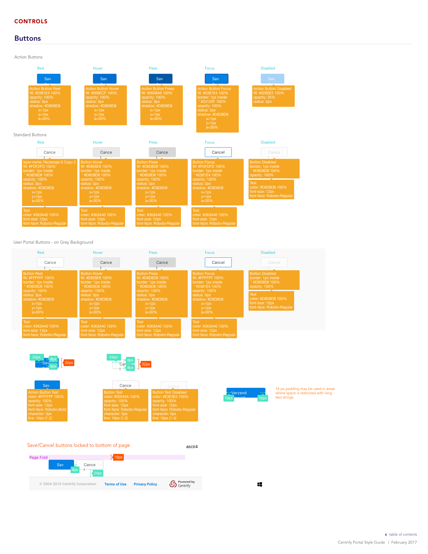
Initiation: Global Style Guide
In tandem with creating new features, I initiated the creating of a global style guide to ensure consistency and allow for quick creation of new elements. Included in this guide were the standard fonts, color, and base elements along with samples of each type of elements. The guide was a shared document that allowed for uploads from other team members of new features contain spacing and CSS documentation.