Q2i Digital Health Solutions - OARS
OARs - Tools for Medical Providers and Patients
Overview
OARS (Opioid Addiction Recovery Support) is used by providers of MAT (medication-assisted treatment) programs to improve insight into a patient’s recovery progress while promoting ownership and adherence to treatment plans. OARS provides the MAT program with real-time reporting and analytics used to efficiently make data-driven decisions. Providing an increased level of insight into a patient’s progress, OARS identifies outliers and trends and can flag areas of concern for investigation and/or intervention. In addition, OARS provides extensive tools to support patients with their recovery.
Problems to address
As addiction rates continue to skyrocket, drug treatment centers find themselves grappling with overwhelming patient volumes. Taking a wholistic approach is an optimal scenario, but the amount of information and coordination with different factions can be difficult for caregivers to quickly identify areas of treatment that need addressing. The UX needed to be robust enough to handle a large amount of information in a quick glance.
Research Results
Research was gathered from medical partners to define the needs. This data was then converted into personas and scenarios for wireframe use. Per the feedback we created this list of needs:
Healthcare Team Portal Needs
Log and track group attendance details
Log and track observations and meeting participation levels
Manage patient’s feedback and emotions
Manage and send educational materials/content distribution
Manage calendars and appointments
Manage test results data
Send and receive secure messages
Patient Portal Needs
Plot their progress and successes, including input from their healthcare team
Receive educational support and content from the healthcare team
Keep a daily journal, log feelings (shared with the healthcare team or kept private)
Message with their group, anonymous and controllable, give and receive group support in a secure, closed circle
Keep a calendar of appointments with reminders
Securely message with the healthcare team
Goal
As with most tools used in the medical profession, the ability to analyze as much information from a variety of sources in a quick overview is key. Our goal was to take the information required for treatment providers, social services, and patients to create clear dashboards and easily accessed tools for outreach notifications, patient engagement, and testing.
Solutions - Healthcare provider
Using the existing framework we reconfigured and streamlined the pages by add more one click entry points and data visualization for quick reference. High fidelity wireframes were created to be used in a prototype for studies verifying the proof of concept.
Dashboard
Attendance Details: Graphs added to top to show current status of overall patient group. Icons are used to indicate positive, negative and areas that need to be addressed. Results are filtered by all patients, a subset for a specific provider, and archived result pages.
Drug Test Results and Editing
Results Managing: Logging and tracking of test results. Patients with positive tests for opioids are noted in the patient list.
Results Updates: Upon additional feedback or testing results, the provider is able to update and repost the results. Analytics are added inline to show a breakdown of the specific result.
Calendar
Calendar view of single patient
Media and Activities Upload
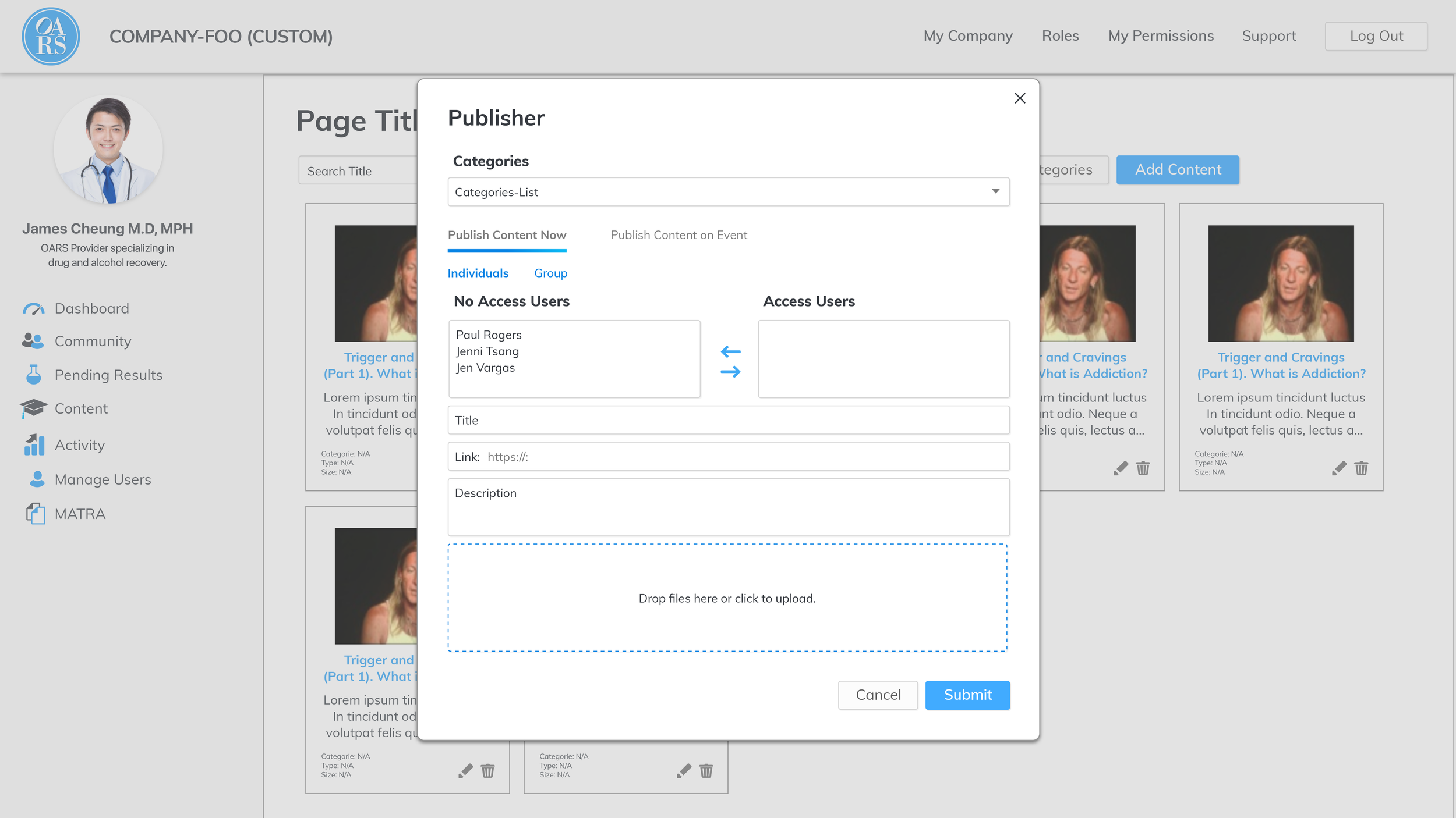
Educational Material: Publishing tool allows the provider the ability upload tools and activities directly for patients to access.
Solutions - Patient
Platform Mobile
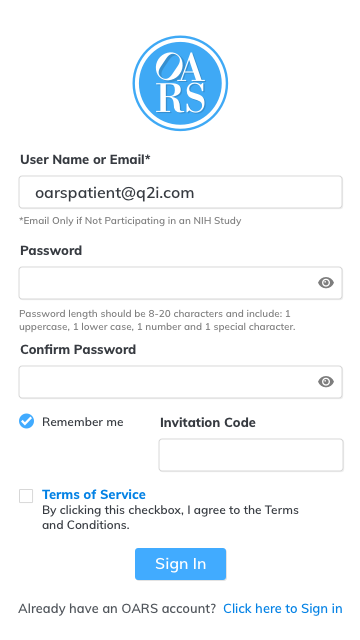
Login and Overview pages
Patient Journal Pages
Testing Results
Takeaways
Feedback from both providers and patients tended to lean primarily that they found the system very easy to use. Most of the comments were that even if not tech-savvy or for seeing the interface for the first time they were not intimidated by it were able to jump right in and use it.
Some of the feedback did revolve around liking the use of color as an indicator. From an accessibly perspective, color should not be a primary indicator, but they also enjoyed the icon usage making this an area to investigate further.
Style Guide and Icon creation
Guide creation in Tandem with UX work
The involvement of style guide creators in the UX process allows an understanding of the design elements, components, and patterns being used, enabling them to create guidelines that are highly relevant and practical. The result is a streamlined and efficient design process, as well as a style guide that enhances the visual appeal and usability of the final product. In this case, I wore both hats, but found the experience to be quite beneficial in full understanding the patterns and variants. By creating this “toolkit” it was much faster to create high fidelity wireframe mockups that were easily altered during iterations of the project. It also allowed for a consistent look at accessibility used across the platform.


