Microsoft Encarta/Student
Design and Incubation work.
About
After years of inbox content, Microsoft Encarta looked to create a richer collaborative experience to better resources for students, parents and teachers. WIth more access to online resources, we were able to focus on in-depth and engaging articles and Interactive experiences. As the product evolved, the team was also looking at home-environment systems used to connect all members of a family or group. Using this premise, Student was born as a collaborative incubation effort.
encarta VIsual Explorations
The goal was to feature Encarta's articles, animations and Discovery Channel video clips, and its interactive atlas with political, physical, and statistical information. The visual direction was created around the same time as the updated version of Windows Vista, and the use of glass and lighting helped to highlight features such as the Visual Browser feature that provided a way to narrow your search on certain topics and highlight featured content.
Role
Visual and UX Designer creating splash screens headers, visual direction, icons, and tool UX structures.
Explorations - Landing screens and Headers
Glass and content.
FInal Home Page
Created the final button, glass treatment, header, top chrome and visual layout.
Release version
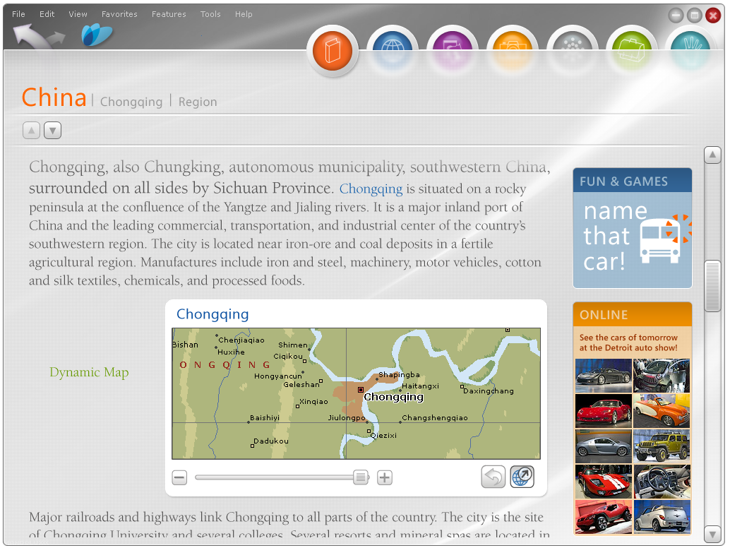
Home Page with dictionary search results, and article view
Dictionary, articles pane, and article overview
Microsoft Student with Encarta Premium
From the release notes, 2008:
To help students meet increasingly challenging educational requirements, Microsoft® Student with Encarta® Premium 2008 was the latest edition of the homework productivity software designed to help students complete their assignments and excel academically.
Technology and the Internet have transformed the way students access information, but the wealth of resources and user-generated content on the Web can make it difficult for students to find relevant tools and accurate information. Microsoft Student with Encarta Premium 2008 provides trusted resources that direct students to accurate and engaging content.
Student homepage and Menu Structure
The homepage was then broken down into categories for quick launching, along with a corresponding dropdown menu for breaking down each sub-category.
Student Menu Icons illustrations
I created a set of icons, mapping to the visuals guides used for Vista. Starting with hand with hand doodles, I converted these to wireframe versions and finally output in full color versions in multiple sizes for a variety of usages.
Dropdown icon creation
MARKETPLACE
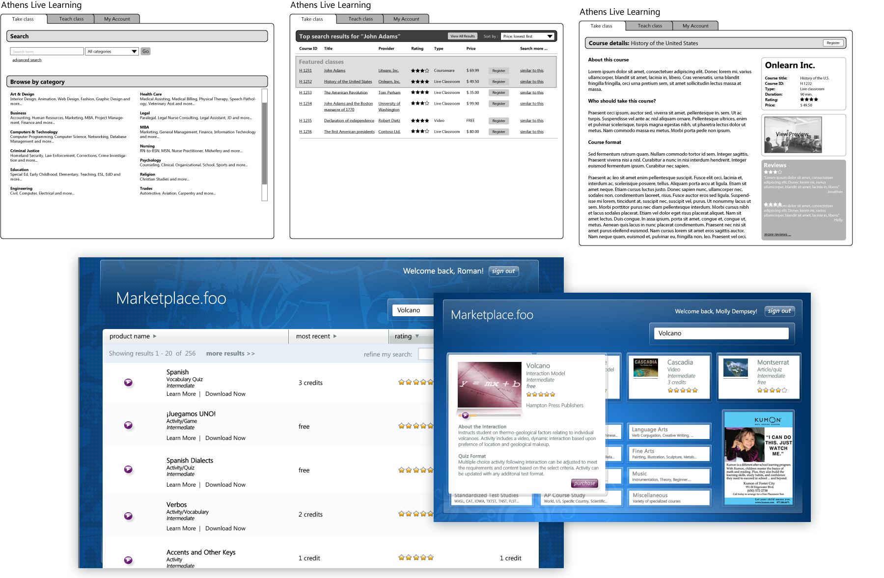
Learning Essentials 2.0 for Students are templates and tutorials transform Microsoft Office Word, PowerPoint® and Excel® converted into student-oriented applications that offer writing and formatting tips for creating well-written and great-looking papers, presentations and reports that help students focus on core learning opportunities and achieve better grades. The following screens show the incubation process and various subject featured.
Marketplace wireframe flow for Bill Gates presentation
Math
The large collection of tools, tutorials and instruction material was streamlined to allow students to efficiently solve problems in basic math, pre-algebra, algebra (including logarithms and exponents) and trigonometry.
Graphing Calculator. The comprehensive tool features extensive 2-D and 3-D graphing and equation-solving capabilities to help students visualize and solve math and science problems.
Step-by-Step Equation Solver. This feature gives students the support needed to complete step-by-step solutions to a variety of math problems.
Equation Library. This resource contains more than 100 common equations and formulas that enable students to identify and easily apply the equation necessary to solve math and science problems.
Students are able to input both using a keyboard or a stylus to work though problems.
Articles
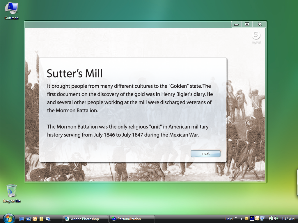
Using the article resources of Encarta, teachers could use the rich content to create templated quizzes based on the content and receive direct feedback from their class. This feature also worked well for individual student studying. Visually, we wanted a rich environment featuring the extensive library of related images.
Magnet
The magnet was an interactive incubation project on a way to sort information by using a “target” to sort and create a hierarchy of tiles results based on your search query.
Interactive Atlas
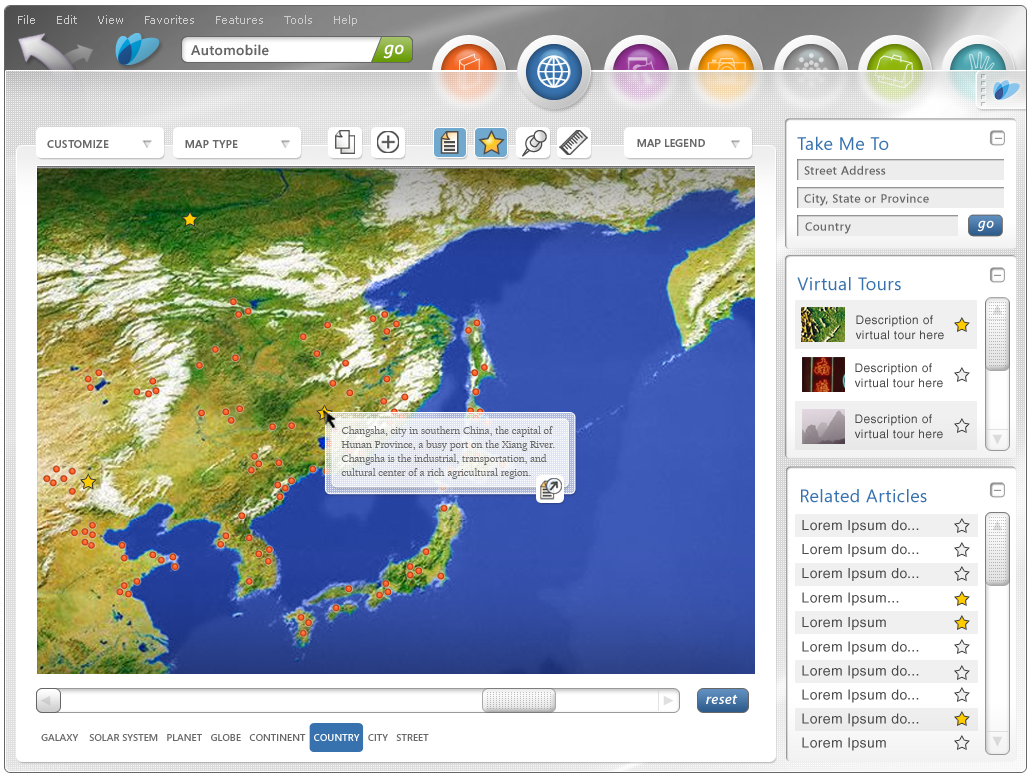
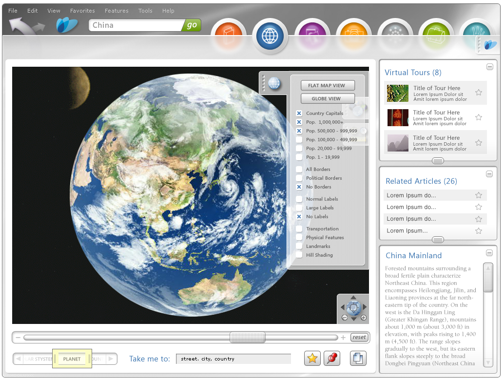
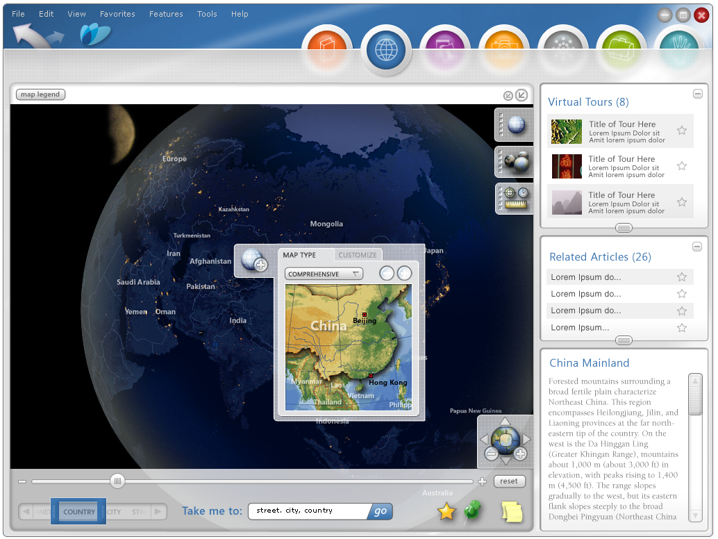
Expanding on the success of the 2000 release of the online Atlas we created an expanded virtual tour of the world, allowing the user to view the Earth in a variety of map styles, ranging from political to a topographical presentation. This also includes measuring distances both on earth and to other planets in our solar system. and night views with informational overlays. Feedback was that this tool was not only helpful for educators and students, the wow factor added more engagement with the tool.
INLINE ARTICLE VIEW STATES
ZOOM STATES
VIEW NAVIGATION


