
Window 8
Reconfiguration of the Windows Operating System with a focus on touch and devices.
Design Approach for Windows 8
When approaching the design for Windows 8, it was crucial to focus on creating a user-friendly, intuitive, and visually appealing interface. Windows 8 introduced several significant changes, including the introduction of the tile-based Start Screen and the emphasis on touch-based interactions.
Embrace the Metro design language
The Metro design language, with its emphasis on clean typography, simple and intuitive icons, and minimalistic layouts, should be at the core of the design approach for Windows 8. Following these design principles will not only create a visually pleasing interface but will also enhance usability.
Optimize for touch interactions
Since Windows 8 is designed to work on both traditional desktop computers and tablets, the design approach should prioritize touch interactions. Create large, easy-to-tap buttons and interactive elements, keeping in mind the average size of fingertips. Use gestures and swipe actions to provide additional functionality and enhance the overall user experience.
Focus on content
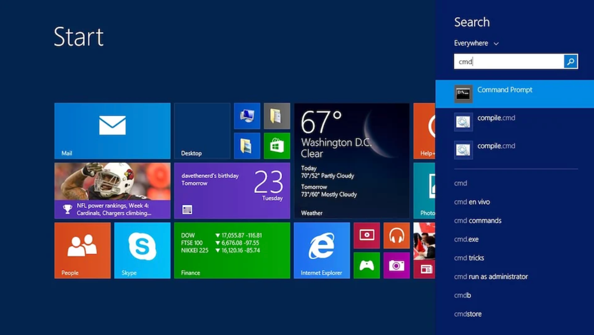
Windows 8 is all about content, and the design approach should aim to highlight it. Utilize the full screen to present content accurately and effectively. Use dynamic tiles to provide live updates and relevant information at a glance. Give users the ability to personalize their Start Screen by allowing them to resize and rearrange tiles.
Provide seamless integration
Windows 8 promotes a unified experience across multiple devices. Design the interface with cross-platform compatibility in mind, ensuring that the interface adapts well to different screen sizes and resolutions. Enable users to synchronize settings, preferences, and data across devices seamlessly.
Prioritize user-centric design
User feedback and usability testing should play a crucial role in shaping the design approach for Windows 8. Regularly test the interface to identify pain points, make improvements, and ensure that the design meets user expectations and accessibility standards. Consider user personas, perform task analyses, and incorporate user-centered design principles to create an interface that is intuitive and efficient.
Provide clear navigation
With the introduction of the Start Screen, it is essential to provide clear and intuitive navigation within the interface. Use visual cues, such as animations, to guide users and inform them about their current location within the interface. Employ consistent navigation patterns throughout the system, ensuring that users can easily find and access the desired features and

Windows 8 Beta fish Evolution
Following the new direction of the Windows 8 visuals, the beta fish got a makeover
Task
With the change of design direction in the Windows 8 product we kept with the beta fish for the Beta release, but made some alterations.. My first thought was origami, but the explorations still had too much depth. The final version took the updated shape, but further cleaned the imagery.
Iterations
The choice to adopt a flatter modern approach in detailing the fish stems from our intention to embrace minimalism. This explorations shows and approach with origami as a styling method with a nod to the Windows 7 fish.

First pass - Britt Hansing
While this first pass at the fish was promising, we understood that there may be refinements and iterations necessary to achieve the desired modern appeal and further simplified.

Final Beta Fish - Leslie MacNeil Webster
window 8 Tiles
Structure, Background, and Colors
Role
Collaborating with the product team and other members of the brand team,I was tasked to create the optimal size for the tiles and tile content.
First pass at the tile structure, background and colors.

Initial thoughts were that having a background under the tiles could be distracting to the content. Moving forward we realized that not being able to change this area did take away from the personalized feeling. Still not willing at this stage to fully embrace backgrounds, simple overlay background with consideration of tile and screen sizes were created to overlay the personalized color.

Windows early imagery under the tile section
Colors
Another area that was debated heavily was the use of colors and if we would restrict the user to a limited set of colors for the tiles to account for accessibly and only allow for the legacy desktop to be completely customized. This led to a very interesting color preference usability study run by Robin Counts from our research team. We presented a set of colors to see both eye tracking and preferences. As this was extremely subjective, we were unsure if we had a definite answer, but it did give us clear direction.

Image used for study

First version of color picker with restricted color settings
Lock Screen (2 patent awards)
The first time you boot into Windows 8 you’ll be introduced to the new Lock screen. This new way to sign-in is by far more functional than anything you might have seen in previous versions of Windows and even in other operating systems. The Lock screen is your first experience getting into the new Windows 8 user-interface (or UI for short), it offers quite useful information: time and date, weather, email, and, if configured, other apps with real-time statuses as well. It also provides battery information, that is of course, if you are using a portable PC.
The Lock screen covers the screen real estate entirely with a background, which you can customize at any time and it sits on top of the new sign-in screen where you can select a user and supply a password (if configured) to get into the account.
Like with most Windows 8 features, all aspects of the Lock screen can be customized, and it also offers what Microsoft calls “glance and go”, an experience that basically means that with just a peek at the screen you get useful live information without even signing in.
My role
I was tasked to create prototypes and layout examples with consideration of text hierarchy, alerts, ideal number of alerts and consideration for layout on all platforms.

Challenges
The largest challenge we faced in creating the lock screen was feature creep. Feature creep refers to the tendency of a project to continuously add more features than originally intended, often leading to scope creep and delays. In the case of designing the lock screen, we initially had a clear vision of creating a simple, user-friendly interface. However, as we delved deeper into the development process, various stakeholders started suggesting additional functionalities that they believed would enhance the user experience. While these ideas were well-intentioned, they threatened to overwhelm the core purpose of the lock screen. Balancing the desire for innovation with maintaining a streamlined and intuitive user interface became a significant challenge throughout the project. We had to constantly reassess and prioritize features, making sure that they truly added value to the user experience and were not just adding unnecessary complexity.
Result
The lockscreen was well-received and found to be useful to the user, especially in the tablet environment. A patent was issued for the icon structure and notifications, and the clock format.